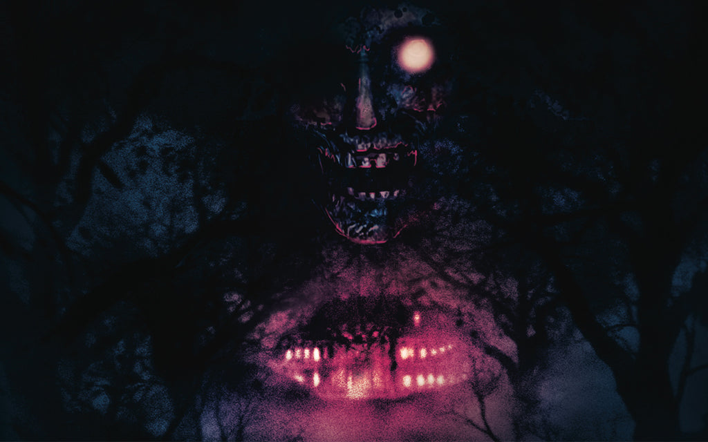

We chat to illustrator and designer Boris Moncel about his influences, and learn more about the horrifying artwork for the Resident Evil and Resident Evil 2 vinyl soundtrack releases.
Originally posted 29th March 2019; updated 15th April 2021
By Thomas Quillfeldt
Few game series are as beloved and long-lasting as Resident Evil. From the moment that players first stepped into the Spencer mansion Resi games have been terrifying fans all over the world.
Interpreting characters and locations from an established universe seems like it would be as nerve-wracking as taking on multiple hunters with a knife, but Boris Moncel of BlackMane Design faced his fears to produce the sleeve art for a string of Laced Resident Evil releases, including double vinyl sets for Resident Evil (2002) and Resident Evil 2 (1998.)
We asked Boris about his background in art and design, and what choices he had to make when interpreting iconic characters and locations from the survival horror classics.
You can check the availability of Laced's Resident Evil vinyl series, including new Limited Edition variants and represses at lacedrecords.com/collections/resident-evil

The Moncel Chronicles
Boris drew from a young age, wanting to become a comic book artist at just eight years old. After attending a renowned art school in Lyon, he started to broaden his knowledge across design disciplines, studying typography, graphic design, and more. His freelance art career has seen him work on board games, paper RPGs, adverts, and in the video game world for both indie and AAA companies.
In terms of influences, he’s omnivorous: “I have so many interests, and for each of those I have tons of people inspiring me everyday. It depends a lot on what I am currently working on, and my mood. When it comes to illustrations, drawing, and concept art I always hold in mind classic painters like Delacroix, Caravaggio, and Rembrandt.”

(Bottoms, top) “Death of Sardanapalus” by Eugène Delacroix; (bottom left) “The Deposition” by Caravaggio; (bottom right) “Self-portrait in a Flat Cap” by Rembrandt van Rijn.
Boris explains: “Those classical masters have inspired so many other artists. For example, look at [American fantasy and science fiction comic book artist] Frank Frazetta and you'll see Caravaggio; look at Mike Mignola's Hellboy and there is Hergé and Rembrandt going on.”
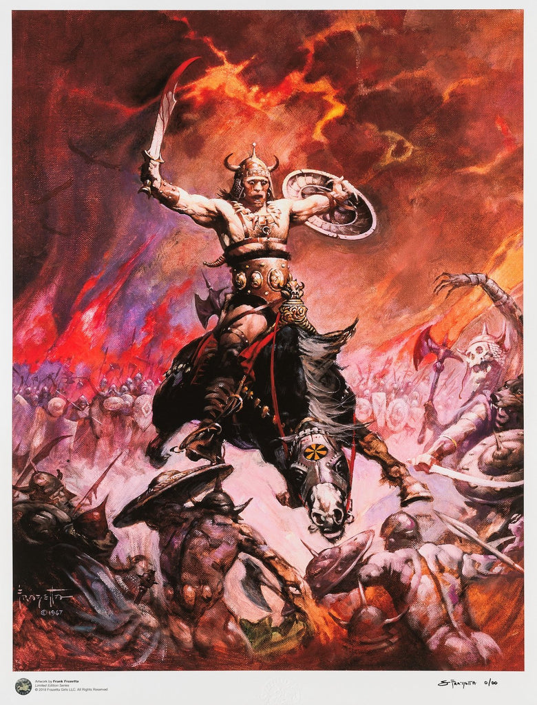
"Conan the Conqueror" by Frank Frazetta.
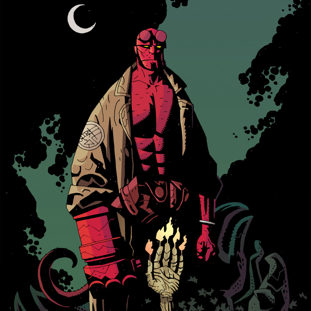
Mike Mignola’s Hellboy.
“The same holds true for graphic design: look at Aaron Draplin (below right) and you'll see Saul Bass (below left); if you check Saul Bass you'll see Constructivism and Bauhaus.”
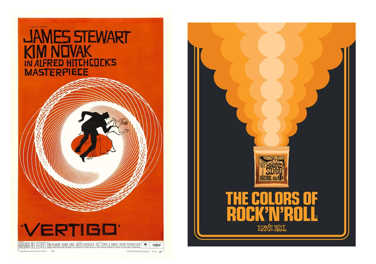
(Left) The movie poster for Hitchcock's Vertigo by Saul Bass; (right) "Ernie Ball - The Colors of Rock'N'Roll" poster by Aaron Draplin.
“Right now, my main inspiration for a comic book project I’m working on is [Polish multidisciplinary artist] Zdzisław Beksiński.”
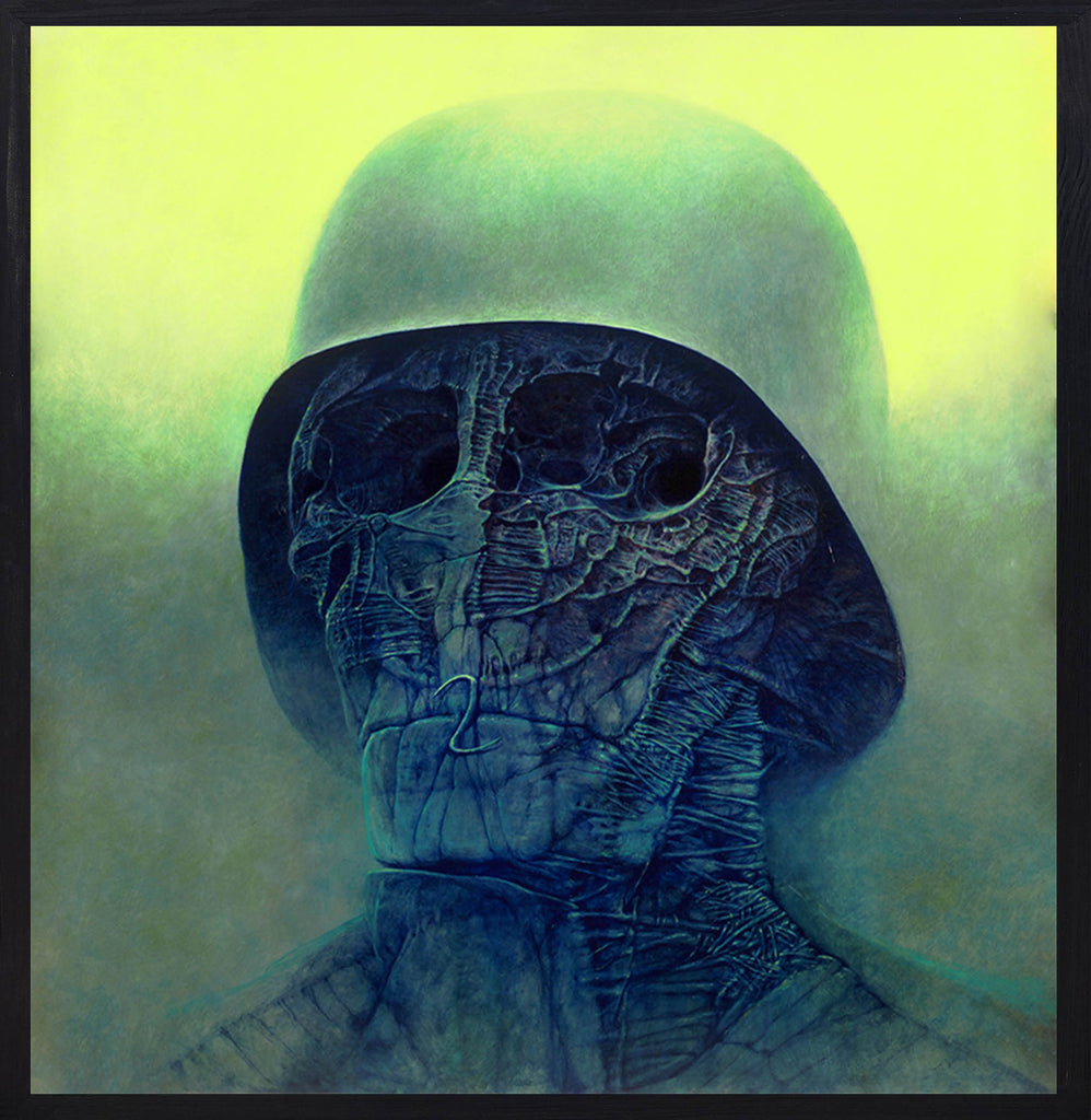
“KO” by Zdzisław Beksiński.
Sound design
The Resident Evil vinyl series is not Boris’s first foray into the land of musical wax, with the designer also having worked on sleeve design for Laced’s releases for Warhammer 40,000: Space Marine (below – top picture) and Warhammer 40,000: Dawn of War II (bottom picture).
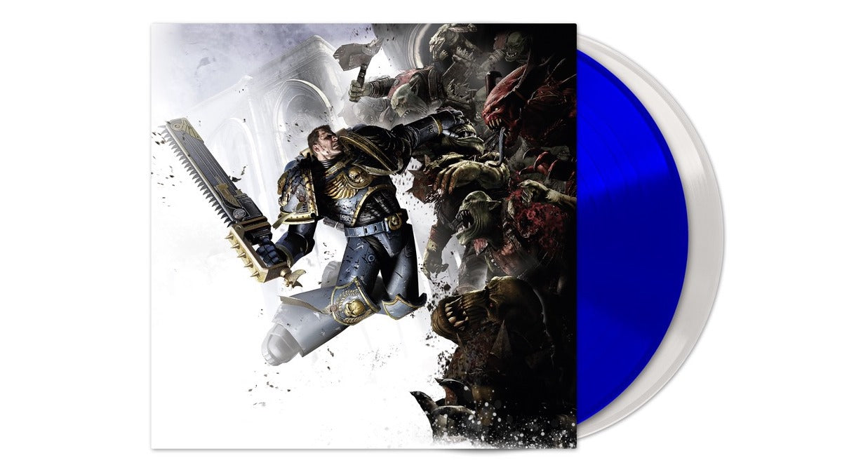
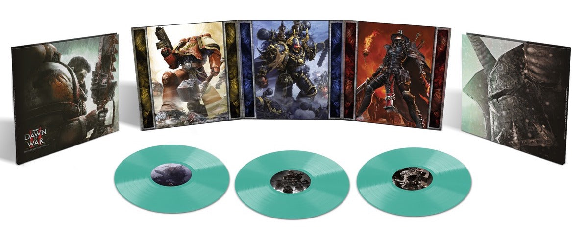
Moncel's dabbled in vinyl collecting, acquiring a few treasured first pressings by metal bands; but it's his gargantuan CD collection that helped him understand what is required when it comes to designing a killer sleeve for a physical music release.
“I love designing for vinyl. It's initially an odd feeling — in a good way — to work within a square format. I don’t find it more challenging than other art commissions any more, but it has its own quirks. I like that the square format invites designers to create an iconic image — I feel this worked well with the Resident Evil covers.”
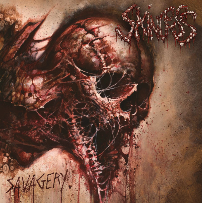
Partial to some death-, black-, and doom metal, Boris recalls that the most striking album cover he’s seen in recent years is that for US band Skinless’ Savagery:
Bloodied sleeves
As a gamer, Boris was right there in the late 1990s as Resident Evil graduated from being a smash hit to a hit franchise, playing the first two titles with his little brother. “Thanks purely to nostalgia, my favourite is the 1996 original. I loved the fixed camera angles; the game featured the kind of shots a filmmaker would frame for a movie. The technical limitations of the time also led to some fantastic game design ideas. Limitations are great!
“The other thing I loved about Resident Evil was the sense of huis-clos — ‘no exit’ — where most of the game takes place in this one crazy mansion. It’s also what I love about Resident Evil VII: Biohazard with the Baker house.”
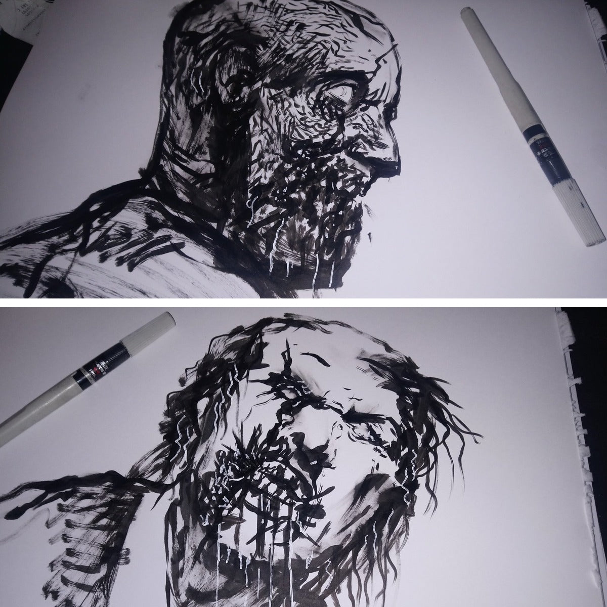
To get in the mood to create the final artwork for the Resident Evil vinyl releases, Boris started off with some sketches: “Nothing to be used later on, just for their own sake as a warm up. These are usually only for my eyes only…”
He has worked on the sleeves for multiple Laced Resident Evil vinyl releases to date, but set the tone for the series right at the top: “I wanted a dominant colour for each of Resident Evil and RE2. This drove my design thinking.”
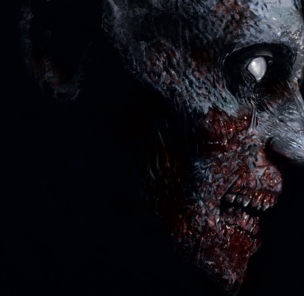
“Next, I needed to identify what is iconic about each of these games. I’d played them both previously and know the series so I tried to draw out what the most iconic imagery was that resonated across the different games. In Resident Evil ‘96 and RE 2002, there is a famous cutscene at the beginning of the game when you stumble upon the first zombie. This moment, at least in the original game, would probably make it into a ‘Top 10 iconic cutscenes of all time’. Everyone remembers it, so it became the foundation for the RE 2002 vinyl front cover.”

(Above) Various stages of the front cover design; (below) Moncel’s final design for the Resident Evil soundtrack vinyl.
“For RE2 '98, I needed something similar and, to my memory, the most iconic monster in the game is the Licker. Rather than base my image on a frame from the in-game cutscene, I illustrated it to be consistent with the RE '02 vinyl cover — side-on, lots of contrast, and plenty of gore! I knew I wanted to create a claustrophobic feeling with both of the front covers, hence why they’re both close-up creature portraits with deep black surrounding them.”
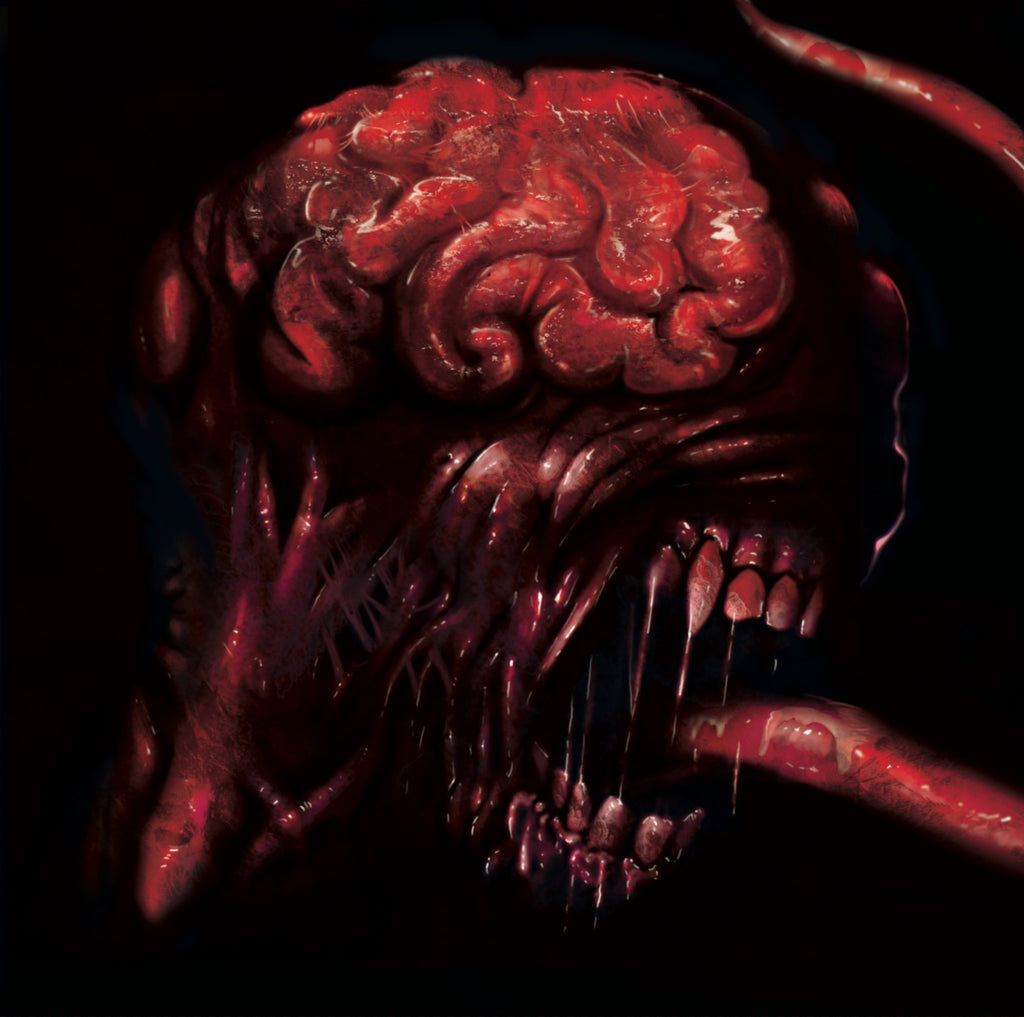
The front cover design for the Resident Evil 2 soundtrack vinyl.
“Similarly iconic images from both games are the principle locations: for RE '02 that means the Spencer mansion; and the Raccoon Police Department for RE2 '98. Those buildings are essentially characters in their own right, so the front of the buildings appear on the respective back covers.”
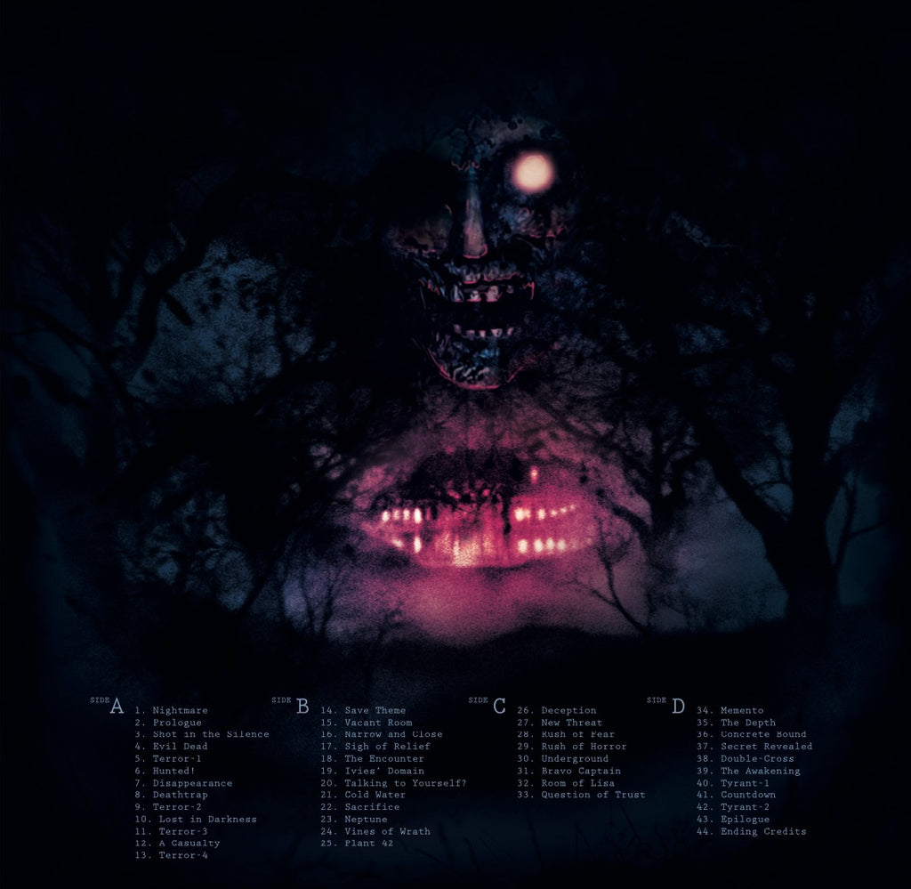
The back cover of the Resident Evil vinyl.
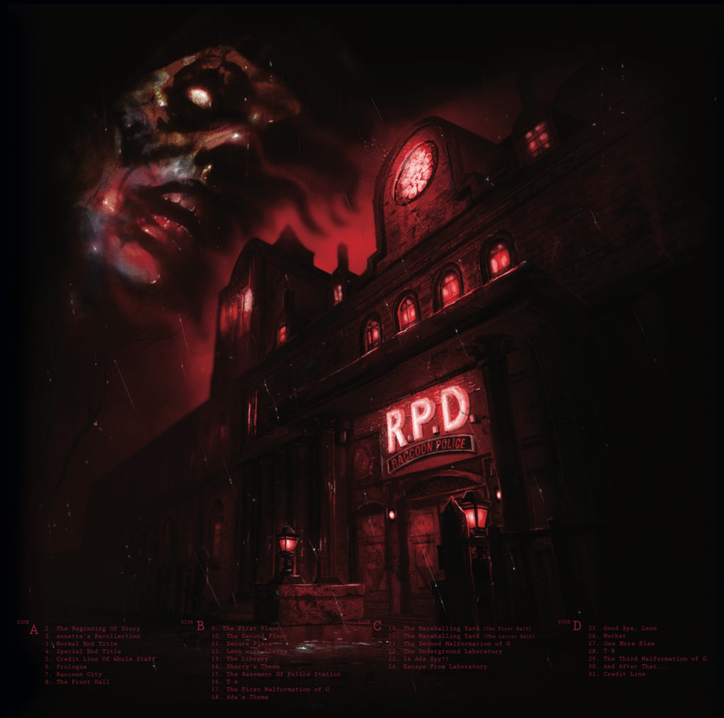
The back cover of the Resident Evil 2 vinyl.
For both packages, the gatefold image comprises the main hall of the respective iconic buildings. Boris adds: “I like the idea that opening the gatefold is like opening the front door and entering into these imposing, drafty atriums.”
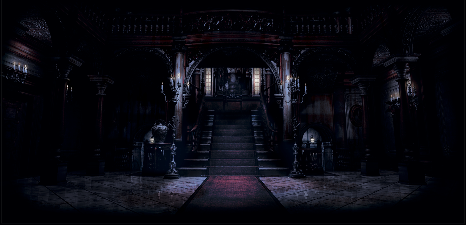
The gatefold of the Resident Evil vinyl.
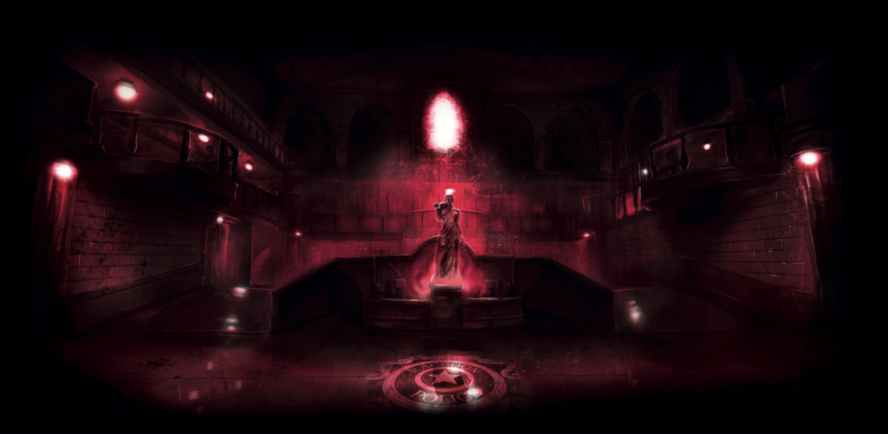
The gatefold of the Resident Evil 2 vinyl.
––––––––––––––––––––––––––––––––––––––––
Boris Moncel (BlackMane Design) is an illustrator and designer – you can get in touch directly via kontakt [at] blackmanedesign [dot] com (he doesn’t bite) | Instagram @blackmane_design | Twitter @BlackManeDesign
You can check the availability of Laced's Resident Evil vinyl series, including new Limited Edition variants and represses at lacedrecords.com/collections/resident-evil


